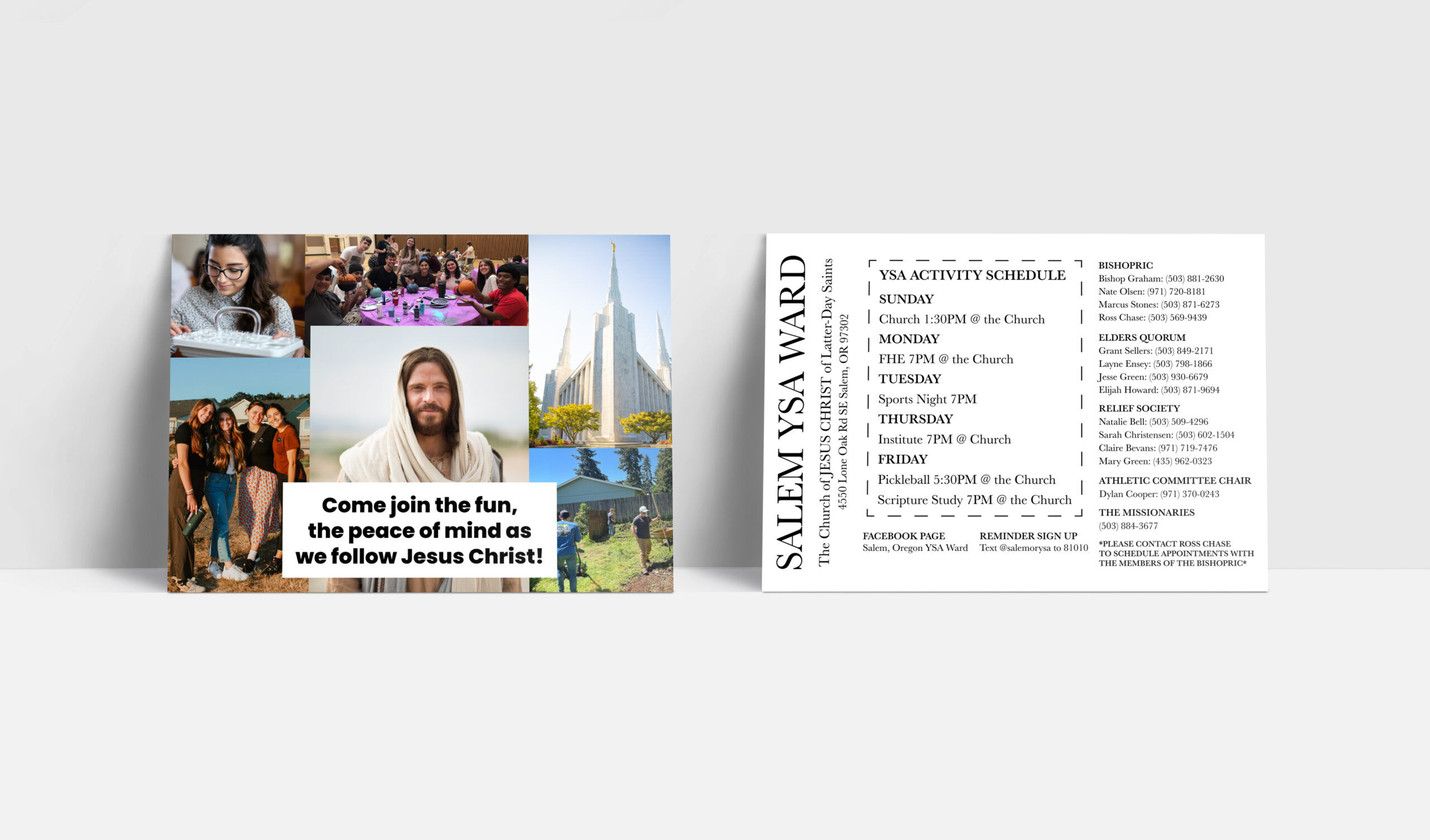
I was tasked to create a contact card for my church. The brief was to create a card that showed the the warmth and friendliness of the church that would make people feel welcomed, comfortable, and excited to attend. The back of the card emphasizes the many activities that go on through out the week. As well as contact information and ways to connect to everyone who attend the church. My use of typography emphasizes the important information in an interesting and engaging way.
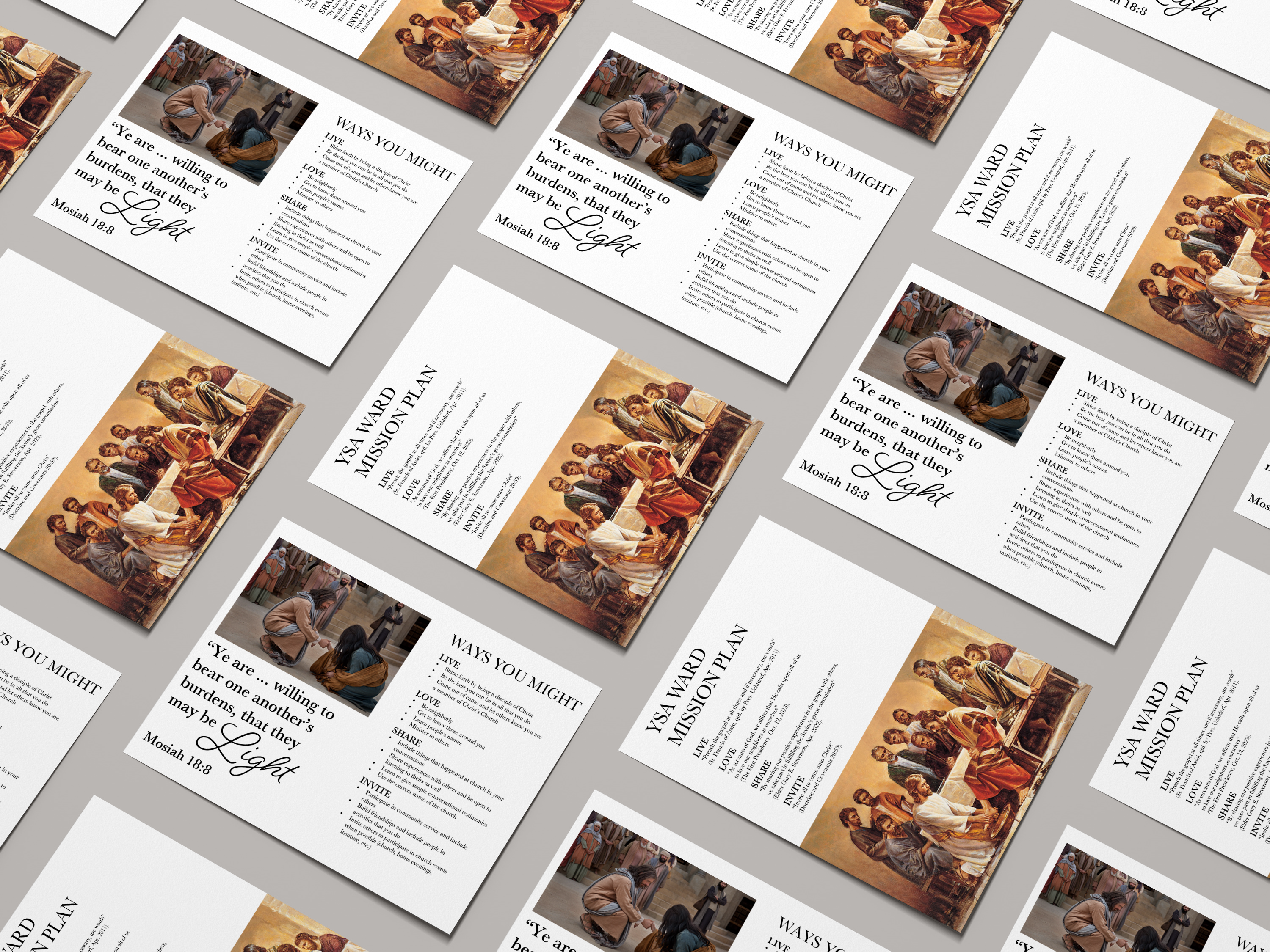
The second image is a flyer for the mission plan. It needed to be informative and help the members get a feel for the spirit of the plan. Love, share, and invite epitomizes Christ and that is who the mission plan is inspired by. This flyer has a more reverent tone to it. I show that through the use of type and images on the flyer.